Staple Socks
Overview
Some things just make sense together. Like good design and everyday essentials. Staple Socks is built on the idea that basics shouldn’t feel basic. The packaging follows the same philosophy minimal at first glance, but layered with intent.
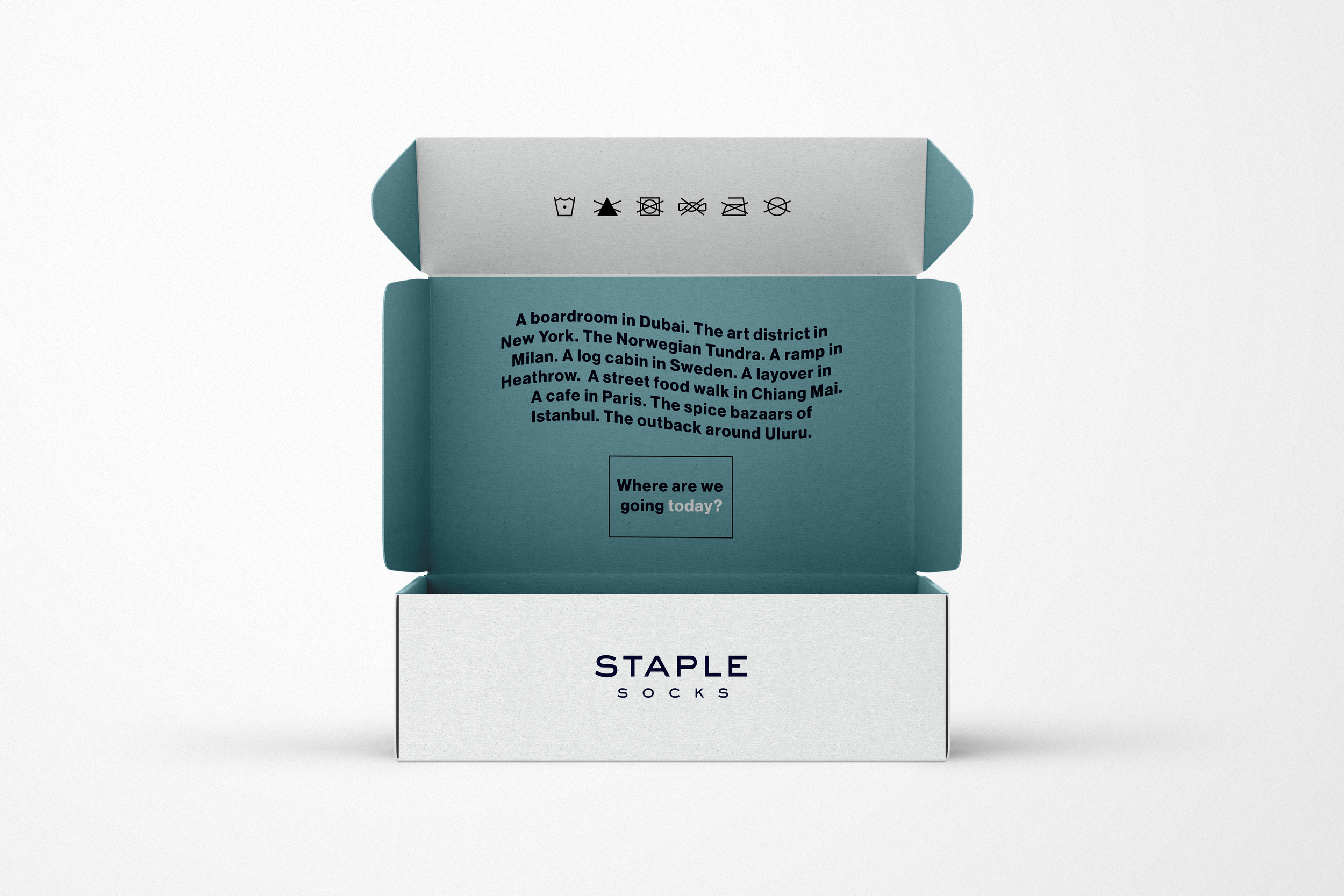
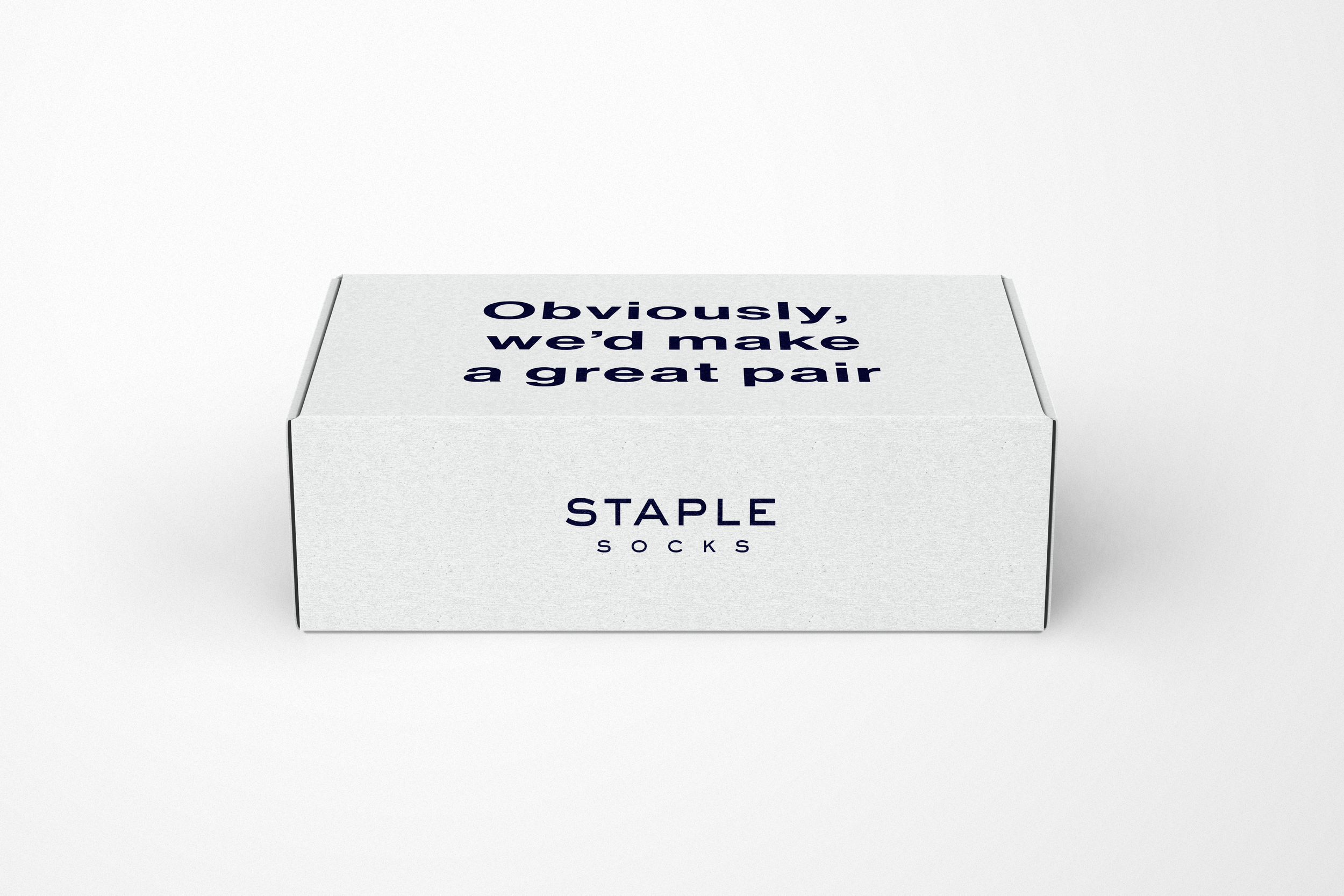
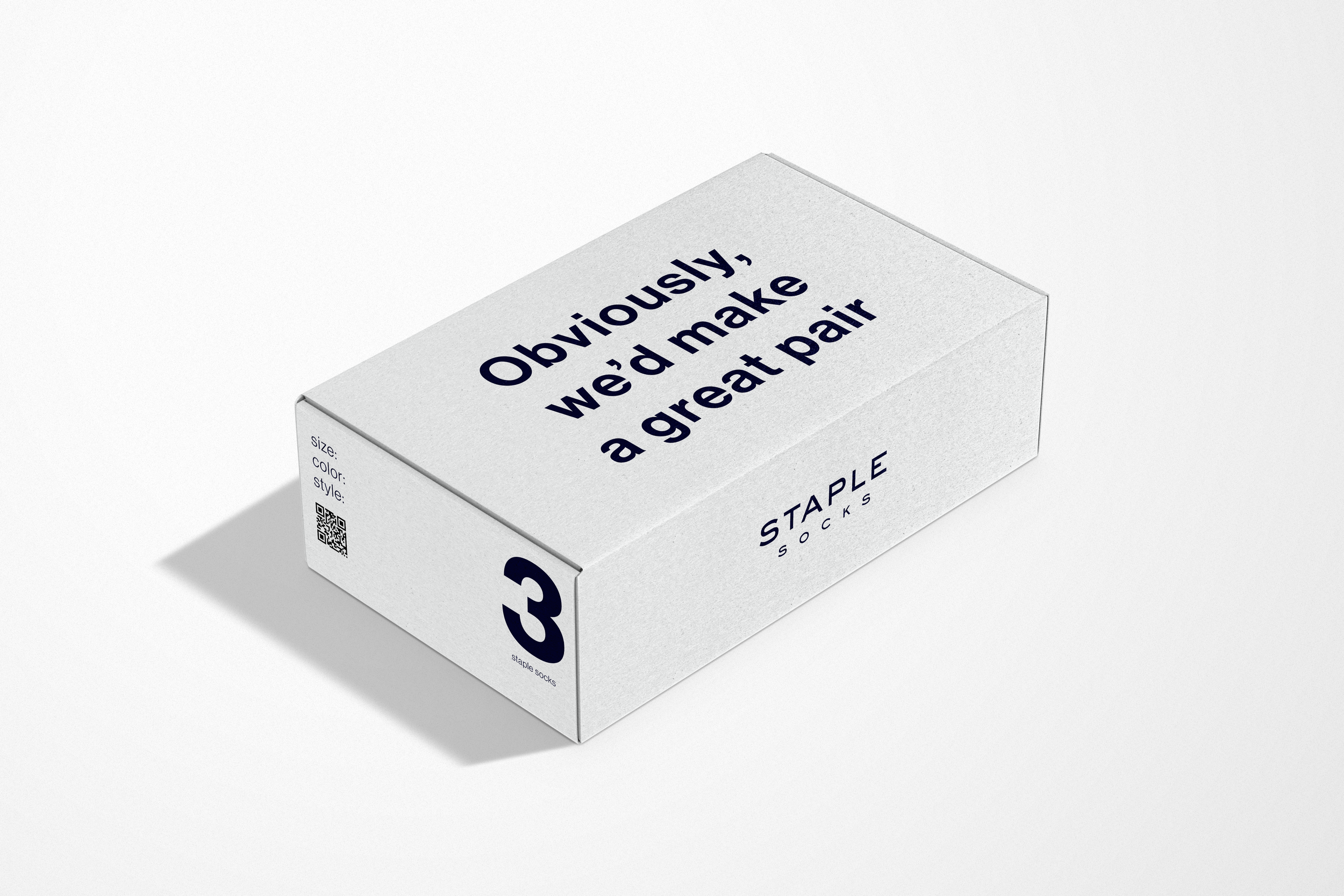
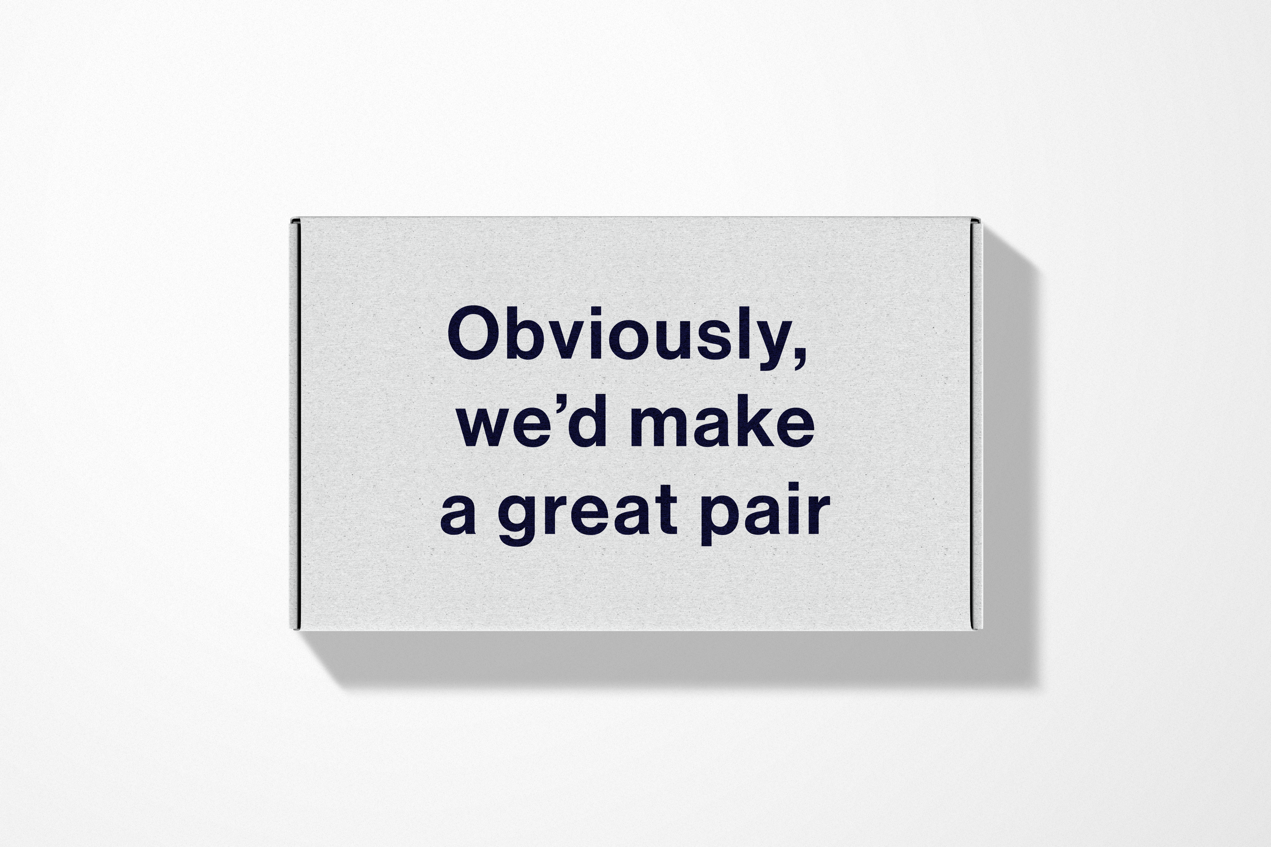
The outer box leads with a confident, self-aware line “Obviously, we’d make a great pair.” It works as both a pickup line and a product promise, designed to catch attention instantly while setting the tone for the brand. Inside, the narrative expands into a more immersive experience. References to places across the world from boardrooms to bazaars position the product as a companion across contexts, not just a functional item. This shifts the perception from utility to lifestyle.
The visual system is rooted in restraint. Clean typography, generous whitespace and a neutral palette anchored by deep navy create a sense of quiet confidence. The structure is deliberately understated, allowing the copy to carry personality while maintaining a premium, tactile feel.
The result is packaging that feels considered, versatile and effortlessly refined. An extension of the product itself.