Pushkar Hans
Overview
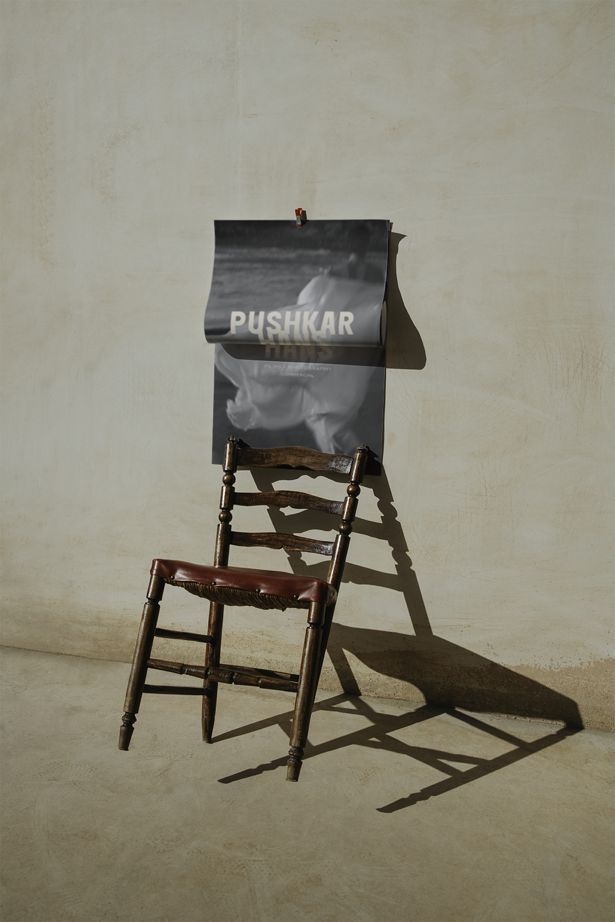
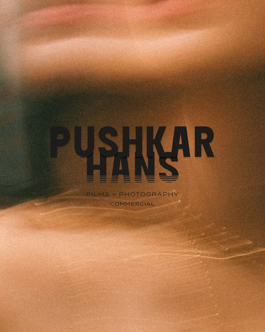
Some visuals aren’t meant to be sharp. They’re meant to be felt. Pushkar Hans’ work lives in motion blur, texture and emotion. The identity system takes cues directly from this visual language, translating it into something structured yet expressive.
At the core is a bold, condensed wordmark that anchors the brand with clarity and presence. The typography is intentionally heavy and grounded, allowing it to hold space against fluid, atmospheric imagery. A subtle distortion detail at the base of the letterforms introduces movement, almost like a frame caught mid-transition. It’s a quiet nod to film, time and imperfection.
The contrast is deliberate. Strong type meets soft visuals. Precision meets abstraction. The colour palette adapts to the work, shifting from monochrome editorial tones to warm, cinematic hues. This flexibility ensures the identity never competes with the imagery but instead amplifies it. Supporting typography remains minimal and understated, reinforcing the hierarchy while keeping the focus on the name and the work itself.
The result is a brand that feels cinematic, contemporary and deeply personal. Designed not just to represent a photographer, but to echo how they see.
Services
Brand Identity
Logo Design
“Working with Persis on my personal and company rebranding was a game changer. At PHP films, with over a decade of work we needed an identity that was timeless yet future-ready. Our new logo is minimal yet powerful, versatile across mediums, and scalable for both print and digital. From precise typography and balanced proportions to ensuring it works seamlessly in monochrome and at small scales, every detail was thought through. What impressed me most was her quick turnaround without compromising quality. The new identity feels premium, contemporary, and truly reflects our vision. Highly recommend Persis for impactful brand design. ”